In the previous article, we introduced the role of physiological clues in perceiving 3D depth vision. Apart from physiological clues, we can also perceive depth through psychological cues.
This article will explore how psychological cues help us perceive 3D depth vision and demonstrate how to create a 3D effect on a 2D screen based on these psychological cues.
Psychological Cues
The direct reason psychological cues help us perceive depth vision is that our brains have been trained for a long time to generate illusions from scenes presented on a two-dimensional plane, leading us to mistakenly perceive these scenes as three-dimensional.
"Size Disparity" is a typical example (see Figure 1): when we draw two objects of different sizes within the same frame, intuitively, our brains perceive the larger object as being closer and the smaller object as being farther away.

After understanding the principles of these psychological cues, computer graphics can leverage these cues to render a 3D illusion on a 2D plane. The following three factors are the most commonly used classic cues:
Interposition
Interposition provides us with a very intuitive feeling: when we place an opaque object on top of another object, the observer will perceive the occluded object as being further away, while the occluding object is perceived as being closer.
As shown in Figure (2), when two shapes are stacked on top of each other in the same plane, although they are at the same distance from us and on the same plane, due to the factor of interposition, we perceive the object being occluded as slightly farther away.
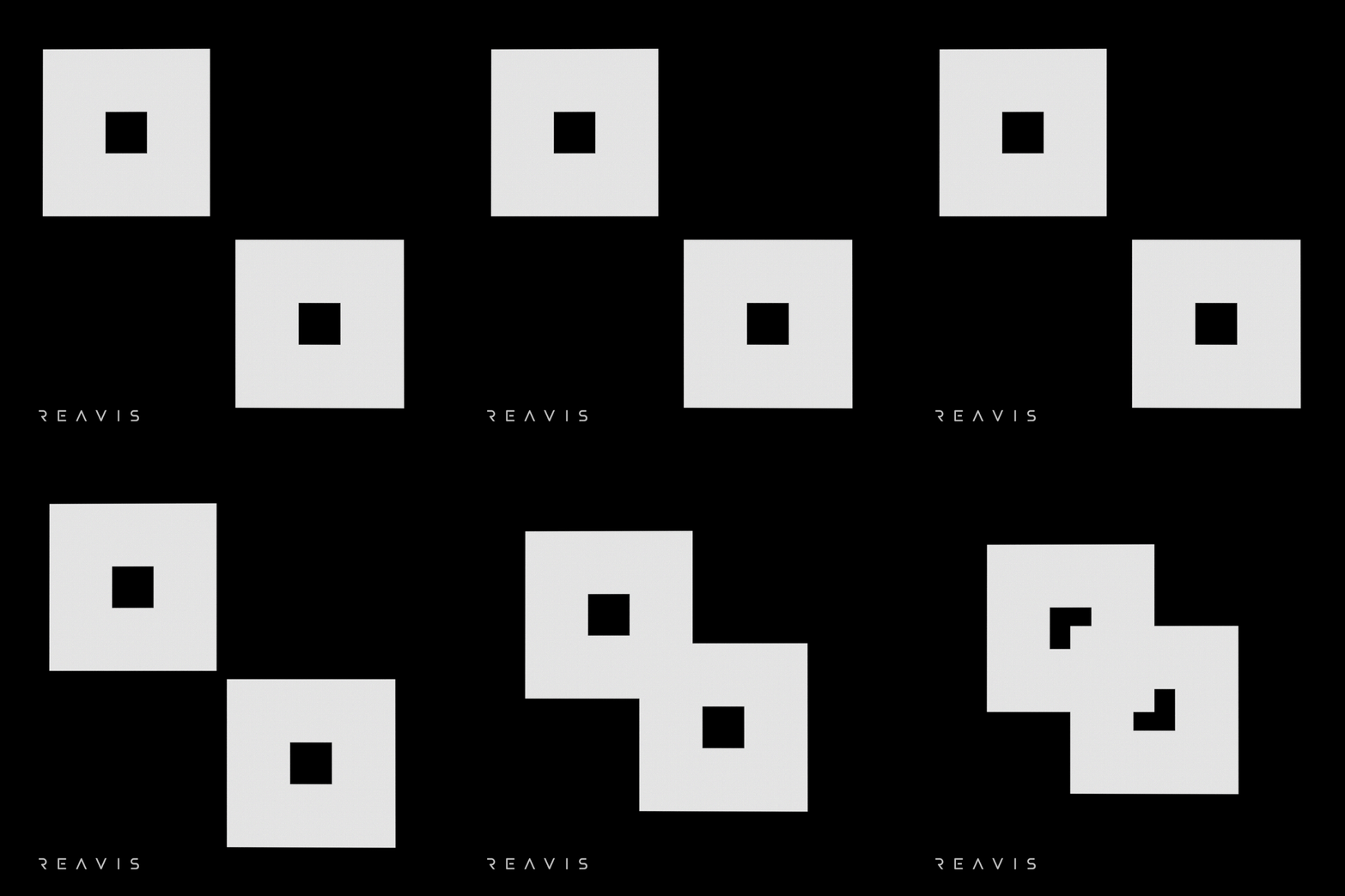
Shading and Shadowing
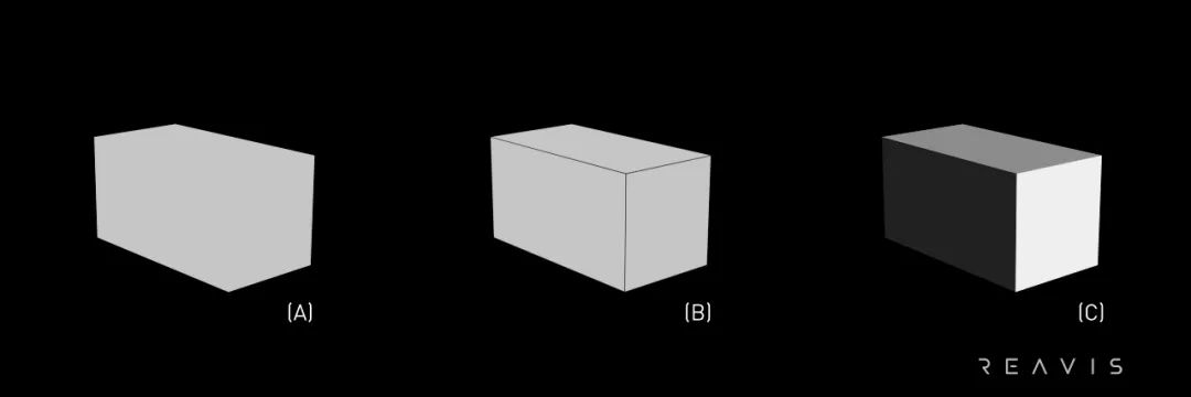
Each object has two different lighting modes—illumination and shadowing. Shading and shadowing (also called shading) provide us with spatial light information about the environment in which an object is located.
By changing the brightness and darkness of objects based on their angle relative to the light and their distance from the light source, thus achieving photorealistic effects, we can successfully create shading in computer graphics. The algorithms used for shading alter the surface color and brightness in the three-dimensional model[1], thereby providing spatial clues.
For example, in Figure (3)(A), the model is not drawn with edges, making it difficult to discern each surface of the model in the image. Figures (3)(A) and (3)(B) depict the same model, with each surface rendered in the same color. Adding edges allows readers to distinguish the shape and surfaces of the model. Figure (3)(C) shows the model with shading applied, giving it a more realistic appearance. We can easily identify each surface of the model, and we can also perceive the direction in which the model is positioned based on the direction of the light source.
Linear Perspective
Linear perspective employs guiding lines to direct the viewer's vision toward the "distance," converging these lines to a small point, which creates a depth illusion for the viewer.
The most significant characteristic of linear perspective is that objects appear smaller as their distance from the viewer increases[2]. A typical scenario is when we stand on a straight road and look downward, we notice that the road narrows as it extends into the distance. The corridor depicted in Figure (4) illustrates a real linear perspective scene.
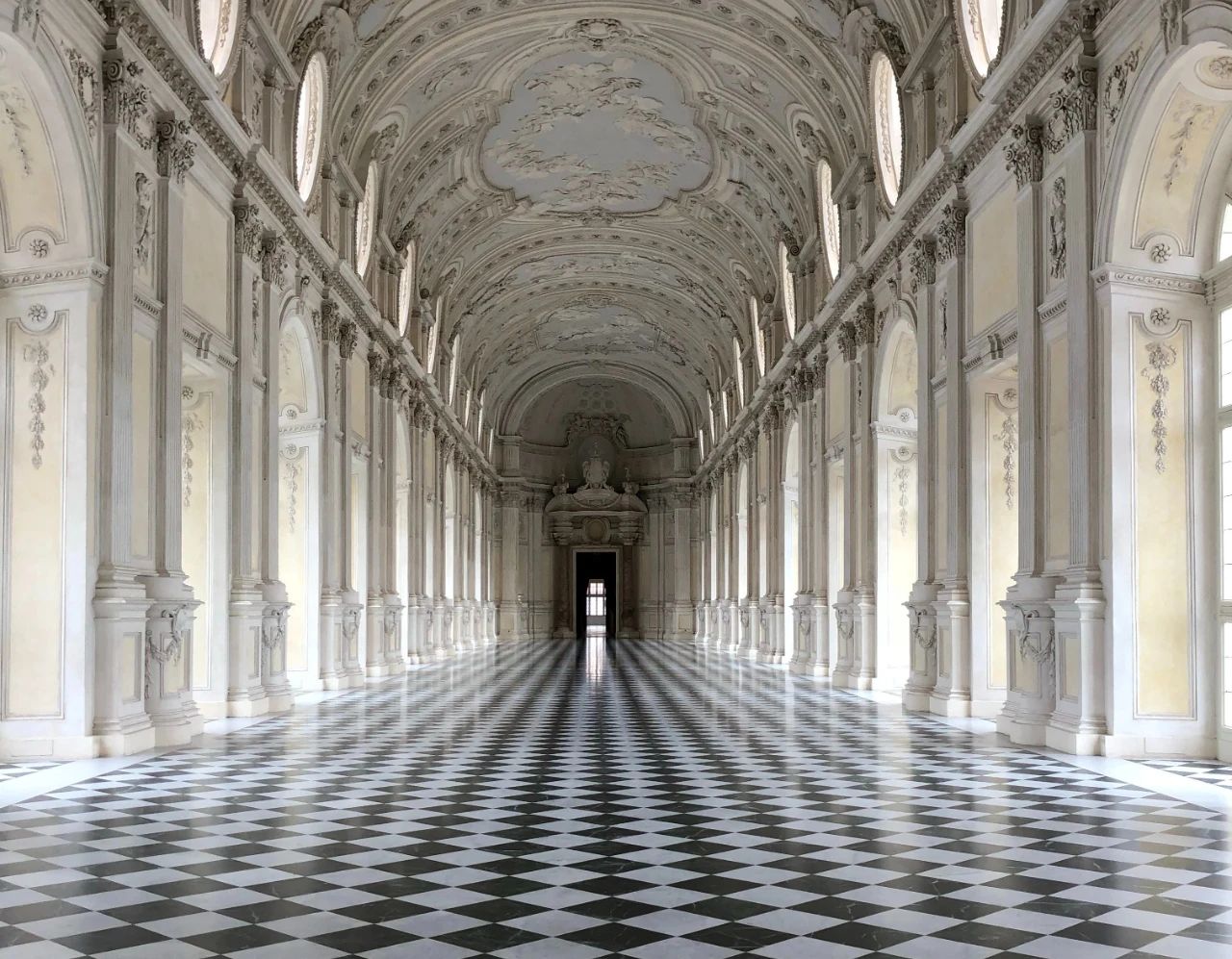
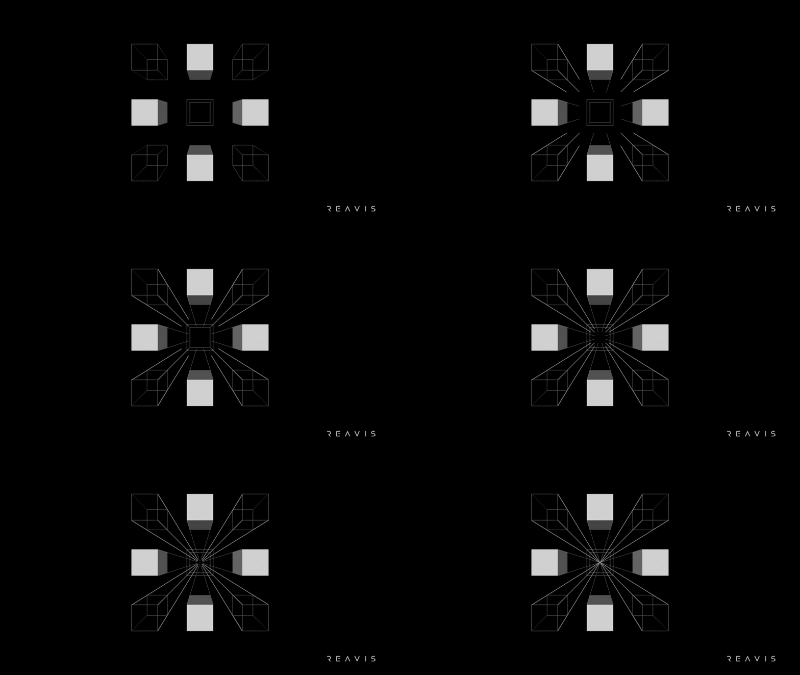
In Figure (4), this corridor directs our vision toward the "distance." Moreover, we also have a sense that the two ends of this corridor intersect at a point infinitely far away; this point is the vanishing point in linear perspective. When a picture contains only one vanishing point on the canvas, it possesses the characteristics of one-point perspective.
One-point perspective is commonly used in images of roads, railroad tracks, corridors, or buildings. When we appreciate such images, we can feel that the scene in the picture extends continuously into the distance, creating a sensation of "receding into the picture." This dynamic effect is illustrated in Figure (5).
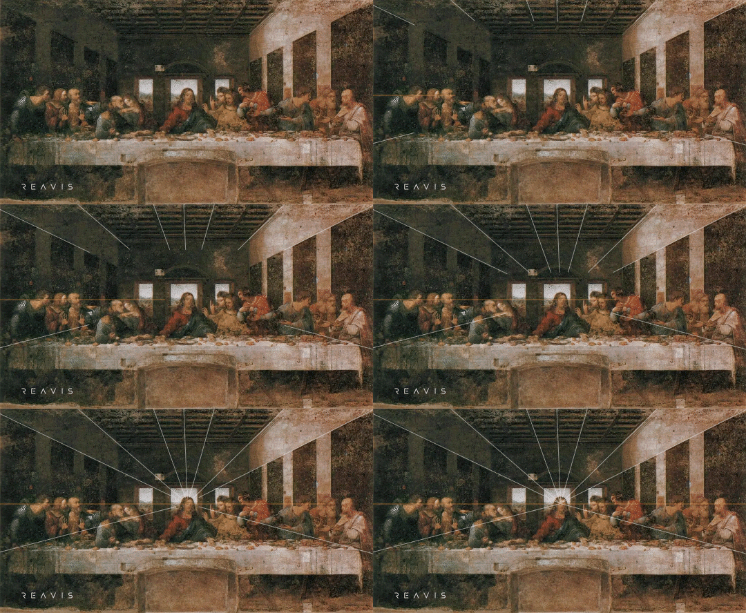
Linear perspective has a wide range of applications in the art of painting. For example, Leonardo da Vinci's "The Last Supper" is one of the most classic works that employs one-point perspective[3][4], as shown in Figure (6).
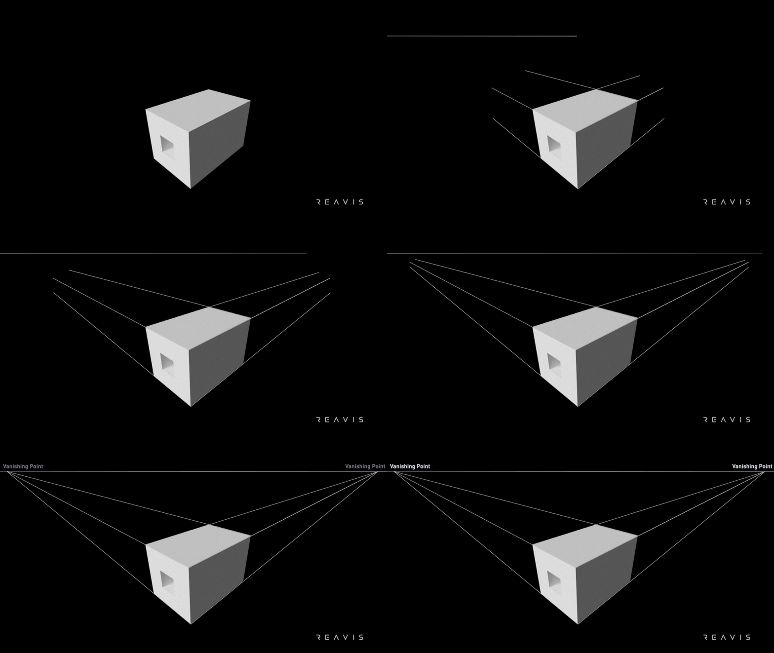
If the vertical contour lines of the cuboid in the picture are parallel to the picture plane, and the other two sets of horizontal main contour lines intersect obliquely with the picture plane, then two vanishing points are formed on the picture, and this picture possesses the characteristics of two-point perspective; specific two-point perspective models are shown in Figure (7).
Two-point perspective is commonly used to depict an image of a corner of a building. When we appreciate such images, we can feel that the two faces of the building in the picture form an angle, thereby giving us a sense of three-dimensionality, creating a sensation of "extending out of the picture." Figure (8) illustrates common two-point perspective scenes.

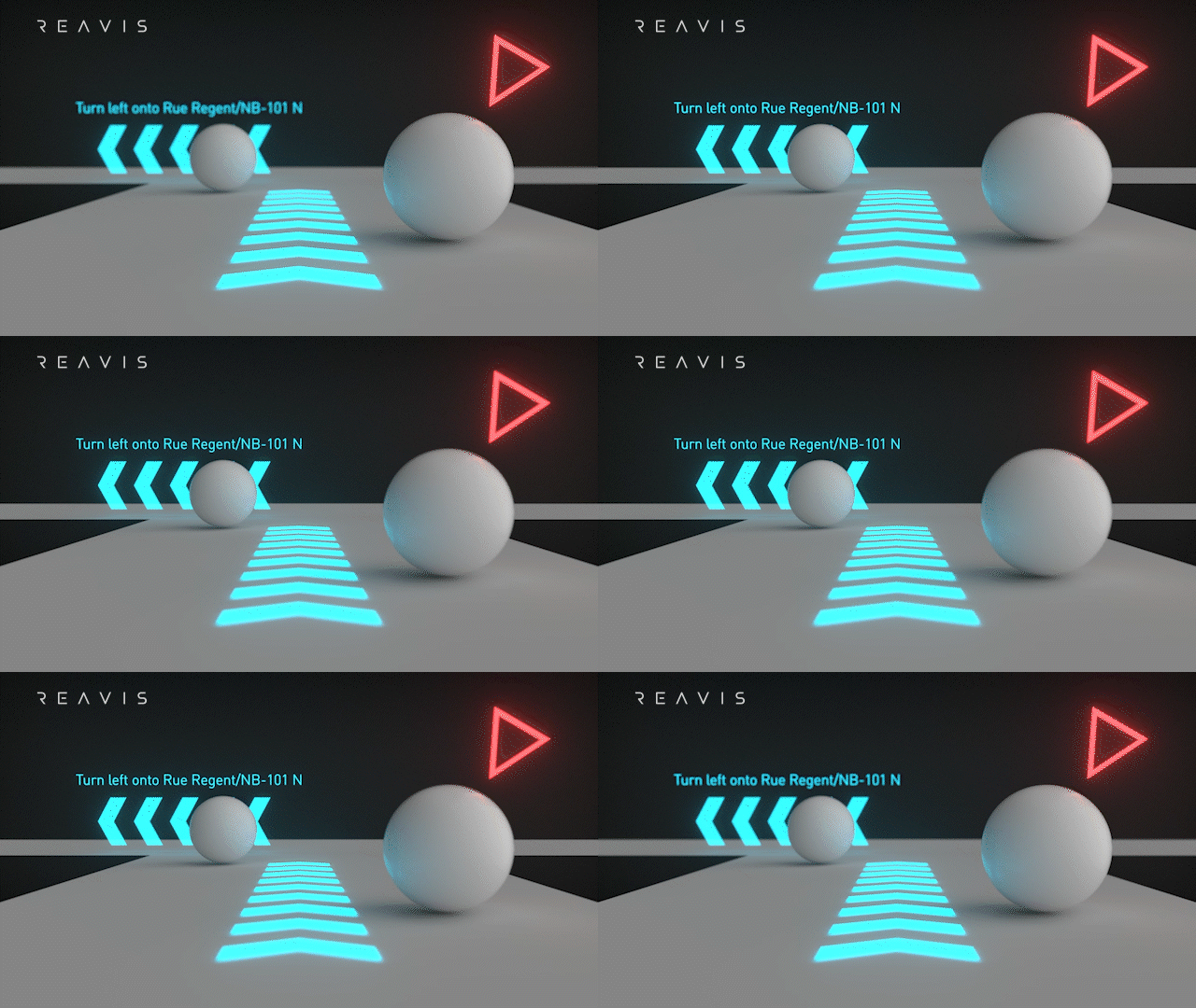
By combining interposition, shading, and perspective, we can create a 3D effect on a flat display, which is also the method used by HUD (Head-Up Display) to achieve a sense of 3D on a 2D plane, as shown in Figure (9). However, 3D displays lacking physiological clues often fall short in terms of effectiveness and may even cause discomfort in specific usage scenarios.
As digital displays become increasingly prevalent, understanding the principles behind 3D generation allows us to better apply them to display products, providing us with a more realistic visual experience.
#Reference:
[1]Dueysdrawings.com. (2012). "Shading Tutorial, How to Shade in Drawing".
[2]Smarthistory at Khan Academy. (2013). "Linear Perspective: Brunelleschi's Experiment".
[3]Dominique Raynaud. (2016). "Studies on Binocular Vision". Cham: Springer International. pp. 53–67.
[4]Dominique Raynaud. (2021). "Las fuentes ópticas de Leonardo". Perspectiva y visión, ed. UAH. pp. 61–62.